Comparison of contemporary artists with a different approach to perspective and form

modern perspective


artist work for Kentridge and Peynton from various authors Vitamin D 2005. Phaidon, london.

william Kentridge- the figures appear ghostly and their bodies float in front of the surroundings due to a translucent and vibrant / urgent marking. The Ward feels slightly wrong in its proportion but does not detract from the work in the same way as Peynton below. The surroundings are meant only to situate the figures in space- they have minimal significance to the work which is all about the message in the figures . For Kentridge this is to suggest the crowding in of the drs- maybe the diagnosis is complicated and the news is bad for the patient or the person in the bed feels uncomfortably on show? Barbara MacAdam in Vitamin D notes that Kentridge works to ” suggest emotionality and drama” in his art image.jpg

Elizabeth Peyntonimage.jpg

Research Part 5 comparison of artist sketching styles-Whistler and Rego

Whistler

I was able to attend an exhibition of Whistler’s work , examining the influence of peer painters and the maturation of his style. One of the most striking developments is his treatment of nude studies. Early on he draws static figures in classical poses. With time these progress to studies of movement. A colleague of the time comments on his originality in his approach to using models. He asked models to move around the room freely instead of adopting formal stances ( Exhibition text: Whistler and Nature at the Fitzwilliam Museum, Cambridge , January 2019.Exhibition developed by Compton Verney, in partnership with The Hunterian, University of Glasgow. ). This allows natural movement and energy in studies such as ‘A dancing Nude’ http://www.jamesabbottmcneillwhistler.org/A-Dancing-Woman-In-A-Pink-Robe-Seen-From-The-Back.html. Gouache and pastel are combined beautifully to depict fabric depth: light transparency and deliberate strong marks. Interestingly in his later mature style he strips back his drawing to something more abstract and ethereal in what the Freer Gallery at the Smithsonian (https://www.freersackler.si.edu/exhibition/whistlers-nudes/) describes as probably his best work achieved through economy in line, shape and colour. It is perhaps the suggestion of fabric and movement that hold the viewer’s attention.  Adoption of this freeness shows that he is trying to capture a new dynamic to his work . I believe that his focus on introducing movement is part of  a desire to make more realistic work.

He also looks for realism by using tone rather than detailed line. He learns to use mixed media to achieve this in his dancing women sketches and early on in drawing  ” in the prison with an old man” he demonstrates that  even though there is economy in the brick wok tone shows the intention of the building. For example effective tonal variety produces a shaft of light diagonally across the wall . It may be minimalistic but it really enhances the meaning and beauty of the work.

resources.metmuseum.org/resources/metpublications/pdf/Whistler_in_America_An_Album_of_Early_Drawings_The_Metropolitan_Museum_Journal_v_5_1972.pdf

This article illustrates this point in his career as a time where he experiments with different styles. He is looking for his own style- through tone, realistic modelling and in his markmaking. One of his experiments is an unusual hatched shading of the background incorporating different directions of lines and really makes his figures stand out. I believe that the years that he spent experimenting and practicing gave him a toolbox of techniques that become automatic to him. Research suggests that free drawing without thought is an essential part of creativity development and it is certainly seen recurring in Whistlers later drawings in the Whistler and Nature exhibition.

Having said this the exhibition shows that his early use of ‘classical’ Greek style nudes fuses with his interest in Japanese themes . These preferences persist throughout his changing techniques and evolving style and the flowing fabric clad ladies are a constant right to the end of his career. It is perhaps comforting that necessary evolution as an artist does not mean that everything about an individual’s work has to change!

Review of line portrait styles

My recent encounter with the line portraiture of France-Lise McGurn  at an exhibition has really challenged my thinking on how I achieve a line based image.*

McGurn uses simple lines and playful marks : sweeping curves for movable limbs and curves and squiggles of facial features. She uses coulur change and overdrawing to suggest ambiguityand challenge in the viewer’s interpretation e.g. Incomplete figures that may be back to back figures or alternatively may be one figure involved in a sexual act (1) … the answer is down to interpretation. Her work shows generic figures and is often temporary as it is painted onto the exhibition site walls. Is this another  message about transience of work or emotions or is it just not taking the work too seriously? Maybe this lack of self concern allows her brief detail- lacking marks to hold meaning? It is a style I have tried to emulate in the last few days but have found it deceptively difficult to achieve as my attempts come out lacking the clarity and personality that she brings to each image.http://www.arteviste.com/arteviste/2016/12/18/a-review-of-france-lise-mcgurn-mondo-throb-at-bosse-baum-in-peckham-londonimage


(1).  http://www.arteviste.com/arteviste/2016/12/18/a-review-of-france-lise-mcgurn-mondo-throb-at-bosse-baum-in-peckham-london

Therefore I have returned to look at other styles hilighted in the course textbook Experimental Drawing P18,19. Albrecht Durer’s contour drawing of his wife and Egon Schiele’s self portrait are shown below.

image

Durrell uses contour drawing with little variation in line colour or thickness. As the author observes he differentiates between cloth and skin by using simple broken line for the body and copious marks for the cloth indication folds and shadow.  Yo me the closenesss and curiousness of the marking show suggest movement and flow of the garments. This is in contrast to McGurn whoes garments are not distinguished from the body and seem to be sculpted onto it. Perhaps the differences to McGurn’s generic figures it is the identity and individuality that Durer seeks that requires differentiation .

I would like to believe that McGurn is saying, ” this is anyone.” While Durer’s message is, ” this is you.”

Scheile has recently become a  valued artist for me because of the vulnerability of his work. His personal journey was short, fevered and  anguished but his progression and exploration of self are evident through the brutality and criticism of his self portraits. He may be as exploitive in his attitude to feminine nude models but he is at least fair in the self exploitation of his own body! By this I mean he draws his own form in the contorted misshapen way that he sees it and makes no attempt at vanity. More than this though his line drawings show delicate body hair sprouting naturally from his twisted form. Although they are still marks without tone they somehow give 3D perspective to his images. Maybe this is the same contradiction of beauty and grotesqueness that I have rejected in a review of John Currin? Somehow in the hands of Scheile this is much more sensitivel achieved.Perhaps the lack of gimmickry makes me believe in him more than Currin?

Like Durer and McGurn, Scheili all put energy into their mark making, as there is no obvious reason or style that explains this it may be the artist’s learned memory patterns in drawing that bring something intangible and personal to the work?


* side note- I was going to write ‘ achieve a line based likeness. ‘  However  it occurred to me that a portrait is not simply about likeness- the image I want to achieve in portraiture will ideally work towards including something of the sitter’s character, soul and environment ?

bibliography

edited by Smith,L. Tassi ,E and Bennet,E. Virginia Woolf, an exhibition inspired by her writings. Tate 2018

Kaupelis,R. Experimental Drawing.1980 Random house, New York.

Review of contemporary artists John Currin and Jenny Saville Leading to a revision on my thinking on nude model use.

John Currin uses a variety of techniques in his drawings which are quite different to his painting work.

image

I like his drawing technique and appreciate his delicate finely defined mark making in the face and shoulders work above left. Definition around the eyes and shading on the face ,coat and scarf define the feminitey . In the other works shown here again it is the tonal definition and expressive movement in the garment mark making that make his work stand out.

Some critics describe his figures as stiff, perhaps because the faces are not complete and the teeth are exadurated. However I think that this style helps to create a believable humility in his work and speaks to me through the well crafted eyes and hilights around them. The white incomplete lines on the cheeks suggest a softer vulnerability in the subject. The top right figure carrying sandals is an example of his contrast work: the model here looks unwell and shocking ( cf the vulumptious over proportioned ‘ beauties’ of his paintings). However it is also striking that this woman has hair and a garment which flow beautifully , blowing in the wind, illustrating one of his key artistic beliefs- painting contrasts of beauty and grotesque. The textural waves of white are tonal and give depth to the work as does the horizontal layering effect.

I also like the the fine detailed strokes in his tonal work of his wife as a model( from Artsy). This time his work is reminiscent of renaissance drawings- perfectly crafted proportions and beautiful models. However the choice to do this as blue on blue makes this more unique than his charcoal on brown paper shown above which now seems to be common place.

IMG_4990I imagine that the choice to showcase such varied styles physically ( brown paper female and Rachel as hag) and to tease the viewer psychologically ( beauty and groteaque ) is part of Currin’s  drive as an artist. He is capable of sensitive pencil work but often chooses to shock – even in his blue pencil portraits of his wife he titles the picture  ‘ Rachel as a hag’. This shock value is best explained by looking at his painted figurative portraits. His paintings disturb me as the most common theme is candy sweet  pictures often with a message of gratuity in sex. I cannot help wondering if the critics’  interpretation that he is joking with us is true or whether there is a personal anxiety that he is dealing with through his work. In fact in a 2009 interview with the New Yorker he states that his response to the ‘ european’ master nude style overwhelms him in its seeming perfection and he feels it is more than he can achieve. His self doubt triggers his response to ‘ regress’ in his portrayals to saucy seaside beauties. This is sad as every artist has the right to be confident in their own style. He feels that what he calls his ‘porn’ nudes is a phase which he must work through. It would be wrong to question his decision to follow his passion but it seems to me a waste of his obvious talent. He himself self says that he cannot allow his young family to see this work.

Rethinking the role of the nude in painting

Studying Curtis’s work has made me come back to this point of discusssion proposed earlier in the module. At the time I was new to the idea of exploitation of nude sitters and the message intended by artists.  In fact I wrote a rather niave commentary of articles on art history!Now after looking at many works and making some of my own my response is less certain. The waters have become rather muddied for me! I have just had an interesting debate with a friend about what Currin’s images say. Personally I don’t agree with critics ( Artsy site) who claim these paintings are hummerous portrayals of the contrast between beauty and grotesque. Yes, they make a statement and the shock factor may be meant to provoke the viewer to think. However what is the need to produce endless versions of what seem to me works in a naughty postcard style which will presumably only dissapear into private collections? Do they not then become a source of sexual gratification? Or am I just missing the joke because my personal belief about art and its purpose is different? I currently feel that the artistic energy and soul crafted into a work is worth more than just a private joke. For example, Jenny Saville and Egon Scheile. Like Currin both Saville and Scheile use themselves in their work, often in unflattering poses but they make the viewer look with new eyes and think rather than the voice of Currin being lost in sauciness?

Perhaps a more serious topic in Currin’s paintings is one showing the torso and groin area of a model with her top pulled up. The head is cut off. Why? Is this not a statement of dismissing her identity and indeed objectifying her? I believe that Currin is choosing to portray sex rather than making a study of the anatomical beauty of the body. I have no right to impose my beliefs onto another’s work but I also cannot help wondering if artists who make work like the torso piece from Currin are being commercial or saying something about themselves?

I have mentioned Jenny Saville as a comparative figurative artist to Currin.  Saville has made her name over the last two decades producing painted and drawn forms mainly of herself in unflattering ‘fleshy’ poses. The difference between her work and Currin’s nudes is striking. Her drawings have progressed from monocolour charcoal representations with movement lines though work over drawn with energetic markings to her 2018 work depicting classical mythology and sculpture. She may well suffer the self doubt that Currin mentions but she has always had the courage to go her own way. Marks are confident and poses seem full of conviction and purpose. There is a sensitivity whether it is of herself foreshortened and balanced awkwardly on a small stool or a portrait of a transgender model. I am not totally sure what brings this sensitivity, perhaps it is the mute limited pallet and a kind of honest portrayal of the body just as it is, no jokes or provocative poses. Practice marks are still left as if showing the ways that the portrait has been carved out from the page- a laboured piece of work that has required input and involvement. The marks are confident and repetitive. This has been suggested as desperation- I think it is more suggestive of self awareness and confidence. Interestingly she has experimented with the shock factor- giros and reflective flesh ( see second Gascogne Gallery reference). These are her least convincing works and lack the confident repetitive marks and gentle relaxed faces of her other works.

It could be argued that women have more of a right to paint nude females and probably do it with more understanding. I think that Savilles exploration of themes such as the rebuilding of the body after plastic surgery carry weight and provoke thought.IMG_4991

I find myself in a state of conflict over life study- but this is probably good from a self development sense- I will think more carefully about what and how I draw. By this I mean that I will try consciously to think about the pose I would choose for a model. is it provocative or demeaning? Also how can I choose a pose to show strength in the sitter or vulnerability if I wish? Can I put across my message in a more sensitive way?  My learning is that models are posed for a reason rather than just being how the model happened to sit down on a chair. I imagine too that my own views will continue to change  and develop with time! I hope that I will be able to learn more about using the psychology of painting.

I am also influenced by the value that markmaking and movement lines add to Saville’s work. Her strokes feel confident and this is evident to the viewer. I want to remain aware of this in my own work. I suffer from losing confidence during assessment pieces and can see from looking at Saville’s drawings how important it is to retain freedom and loose drawing.

bibliograph

Forward by Dexter, E. Vutamin D new perspectives in drawing. Phadon, New York.2013.

https://www.newyorker.com/magazine/2008/01/28/lifting-the-veil

https://www.artsy.net/artist/john-currin

https://gagosian.com/exhibitions/2018/jenny-saville-ancestors/

https://gagosian.com/artists/jenny-saville/


Visit to Virginia Woolf and links to contemporary female artists at The Fitzwilliam Museum

89FC67D1-5063-4CD4-94F2-2214DE4413A0
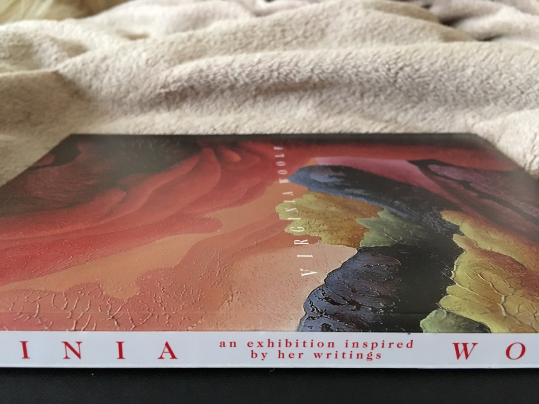
Virginia Woolf Exhibition – the Fitzwilliam Museum, Cambridge 27/11/18

This is a fascinating exhibition* which has been on a UK tour. Talking to museum staff I understand that it is unusual and quite unique in its format. Certain aspects of Woolf’s characteristics are examined in respect to her diary and essay writings. The unique aspect is that works by C20 and 21 st artists who show similar traits are shown along side. As many of the complimentary exhibits are portraits this fits perfectly into my current module studies and the theme occurring in my mind around how artist’s emotion effects work.I was captivated by the incite that this gives.

On a personal note, I am very encouraged to have made this second visit to a gallery and I have been able to look at work with a more critical appraisal and in a way that will inform my own process. I think this development is happening as a result of my growing confidence resulting from module exercises, direction from my tutor and the experience of a virtual study visit.

My practice has been changed by this visit because no photographs were allowed. Being forced to make on -the -spot notes and descriptions of paintings and drawings has made me think more deeply ablout what a I appreciate and what main features show through in each one.

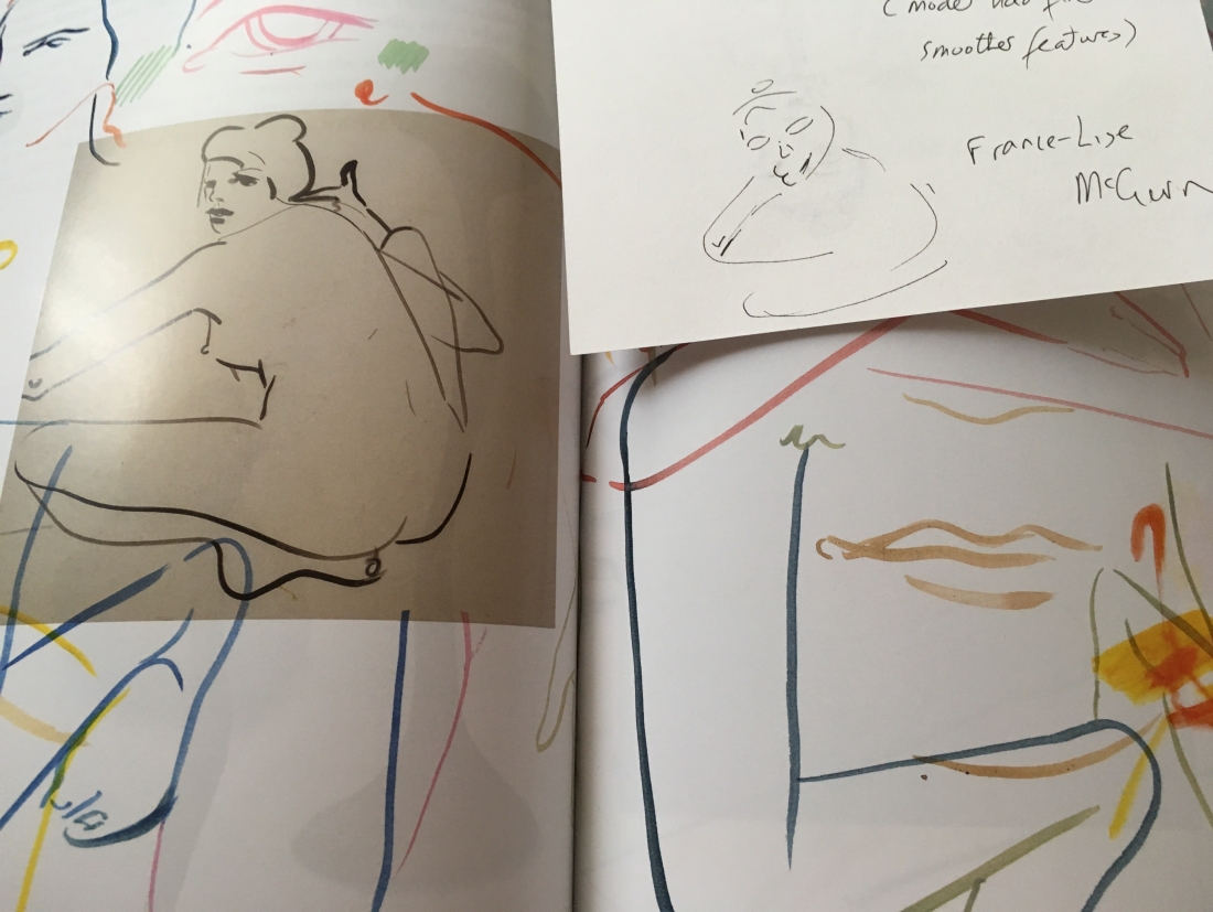
after leaving the exhibition I sketched some of the portraits which affected me most to see what I could remember. I was inspired for once to buy the catalogue and below are the results of what I described and could recall from  this. A really useful exercise to see what I already focus on and where I need to concentrate my future looking!

Notes:
Self portraits- Woolf’s writings portray her as a strong female who was active in following her convictions ( e.g. Suffragette movement)
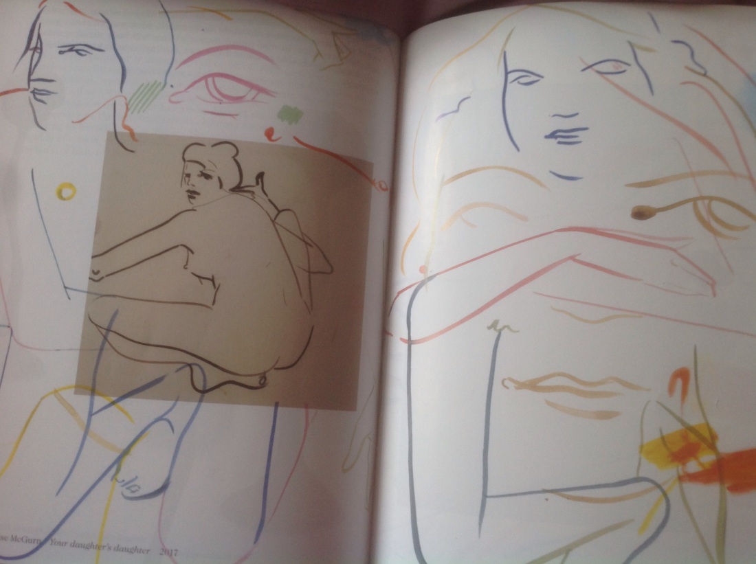
Francis – lisa McGrun 1983 :line and brush clean no shadow or tone except heavier lip and eye lines chin horizontal line eye line a bracket filled in eyes down turned broken line nose. A line only portrait which is extremely effective and reveals a strong image of the artist.

d17c4a2e-0196-4549-800f-1c14e3303861.jpeg

9c9b09d9-5569-4f5a-95c5-7ee203670a5f.jpeg
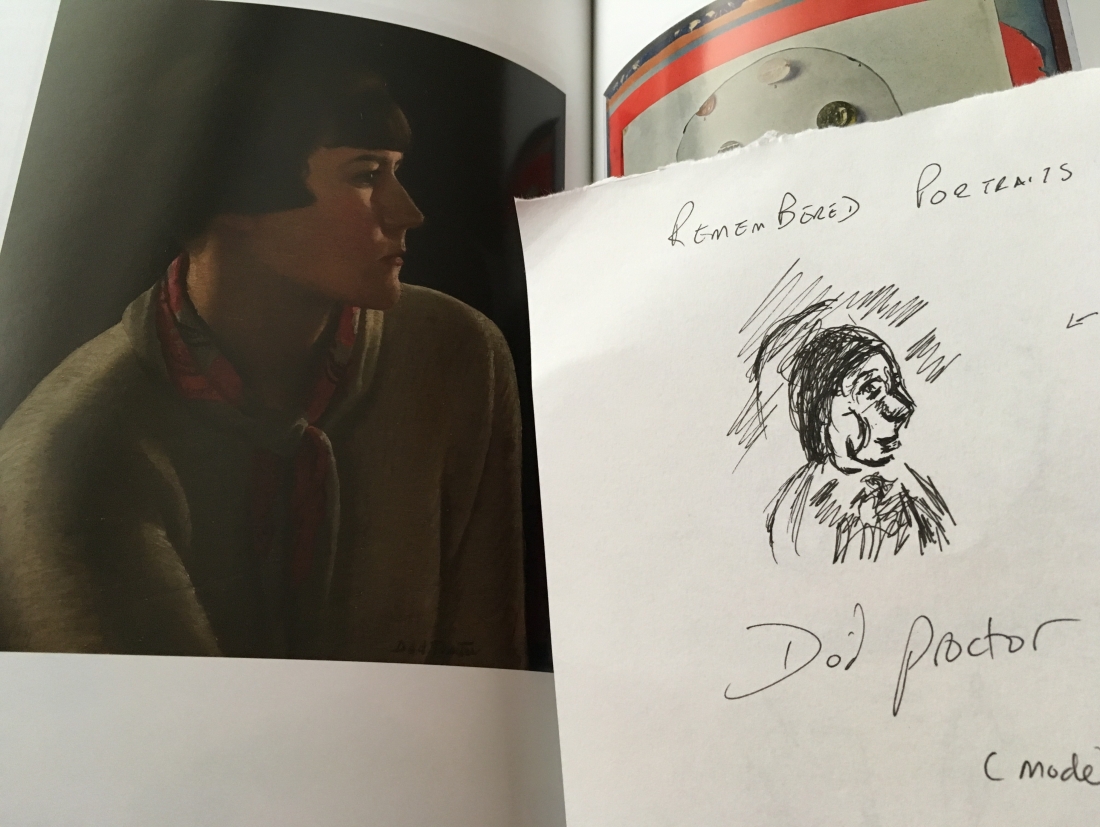
Dod proctor 1920 -oil side view.  She was a member of the newlyn school. This work illustrates  cornish white light hilights on cheek as an hourglass below near eye, on the  forehead and near arm and far arm. Beautiful contrast to dark background and simple hair structure plain jumper compliments simple image.

Late venessa bell texture and tone and heavy brush strokes shows vulnerability, dark shadows show a weariness to me. This may be because it is hung between young clean images of Proctor and John.

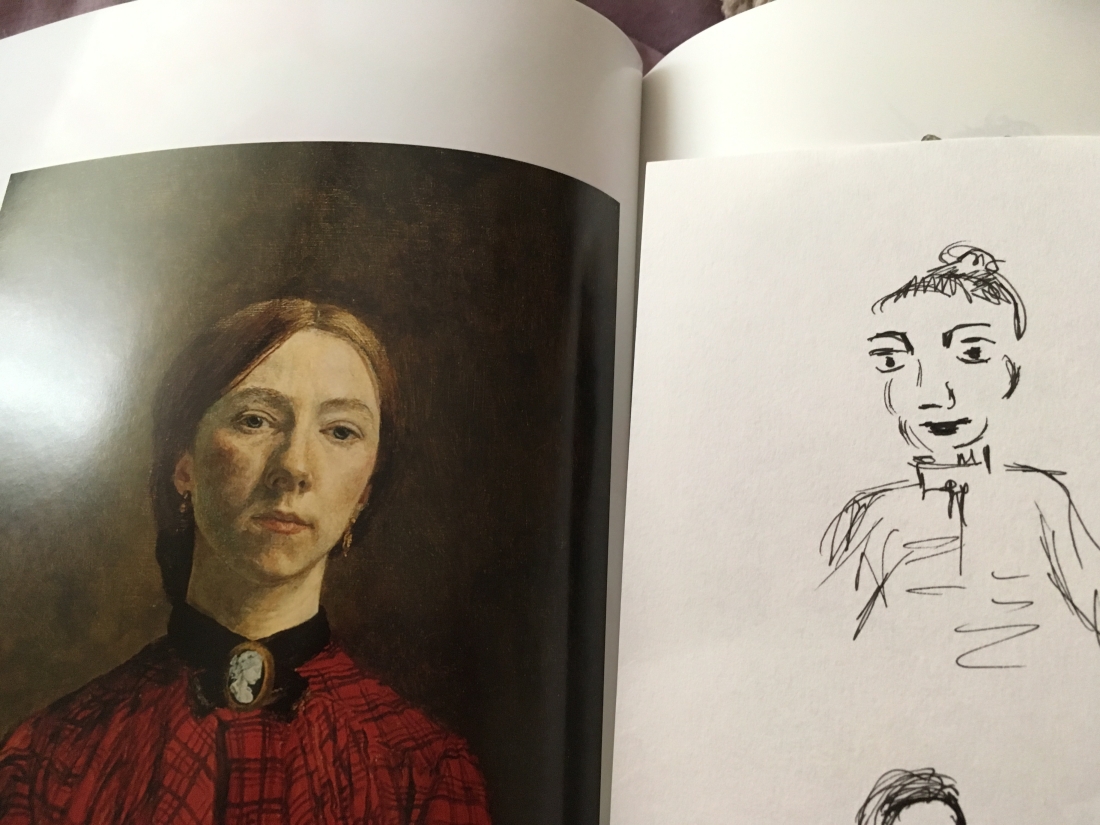
Gwen john 1902 pale skin and hard lines on bone structue and eyebrows show strength yet softness through femminine red dress

6ce9fd91-c5a0-464c-b86c-fdb381e1fcd9.jpeg

Dora carrington life sculpture nude climbing statue. These are an early example of performance art photographs! Carrington
Suffragette memorabilia- in out of prison game! And hat pin designs downing st and the holloway! Grim sense of humour!

Portraits
Romaine brooks 1908 the white bird full length white dress and white face no red or shade on cheeks or shadow on face stark b and w effective and whan look but black emphasis on bone structure gives character and a sense of strength.

Laura knight- joan rhodes 1955-oil cheeks and side pose using pastel colours show vulnerability with contast to sculpted and contoured bone structure Indicating strength.texture lines indicate light hilights on hair and clothes detail6C808F4A-C156-4C36-AE08-25A2151BBB4A

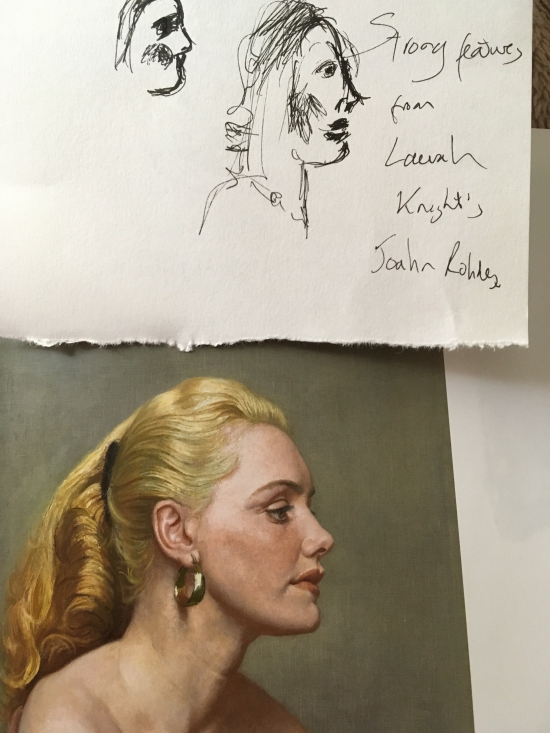
Ithel colquhoun the alcove 1946 decalcoman surealist technique paint squeezed between two paper layers to create mirror image

Georgina houghton surrealist spiratualist gouache and watercolour in sketch book with pen and ink added complex layered claimed influence by spirituality voices but certainly have energy

Lucy stein book of shadows 2017 – oil,charcoal and collage on canvas similarity to Woolf’s work splintered personalit. This is referenced in her essay’ a room of ones own’ 1920. She described life as inhabiting rooms in a house. This metaphor describes her thoughts on female artists at the time who were struggling to get into rooms and be recognised and on another the different parts of. Her personality and characteristics lived in different room in her house. In a similar vein stein refers ‘to her and not her’ and one critic sees her image as a contrast of’ beautiful and horror ‘ and explores personal and art hostory in a confessional, delerious way, “my body of work is also my body dissceminated”.

image17.jpg

Emma talbot 2016 acrylic on silk banner- interpreting my dreams.With a pattern framing a cartoon and word pictures- unconscious narrative in  speech bubbles which interpreted her dreams. This is a striking work- a wall hanging which seems to connect well with ‘ ordinary ‘ people in this format but it is also a character portrait of

Vw essay a room of ones own 1920 paralells rooms to creativity of women and different rooms as different splinters of personality

I really love Issy Wood’s portrait patcel guilt 2017. This portrait is strange as it does not show facial features- the most strong way to represent human recognition and identity. Is Wood trying to say that the figure is feeling guilty and lacks self confidence? That they have no awareness of their identity? The breast foreshortened and prominent so  suggests womanhood and perhaps this is the figures only perceived worth? The fading of the hair and body could suggest movement or perhaps fading of the woman into the background? It feels sonehow a very raw work and yet it is franed by suggested long wavy hair and the femininity of the breast.Each if my interpretations are of vourse personal and based  on my own experiences but I am certain that the artist has used the devices I have discussed to provoke thought in the viewer and this for ne makes a powerful piece of art as much as technical ability.  I find my self drawn to the work of Wood, Stein and McGrun for the energy and sense of the artist’s presence. This sense is also present in Proctor and Knight’s strong featured women. The latter two are prettier and more traditional in their feel but they also use artistic devices to portray feelings in an appropriate way for their earlier tome period. E.g. Proctor’s slightly unvonventional bright cornish light and simple sharp head with minimal tone and Knights almost harsh treatment of her subjects large jaw bone showing power in the sitter but subtly feminised by delicate pastel volouring. image

Vw nature and women comparison  metaphores. Comparison  to women land art nancy holt, marie yate
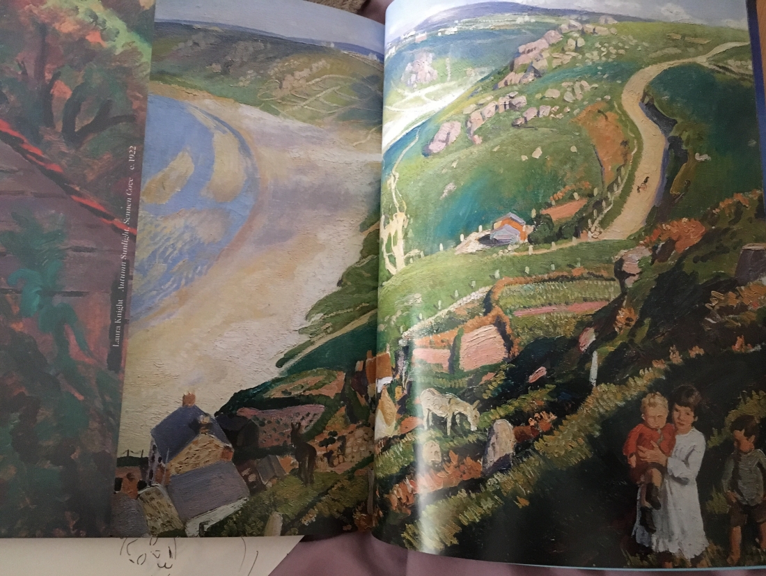
Many of laura knight’s works have detailed figures to side of sea- yet not out of proportion power of nature eg dark pool and autumn light at sennan

image18.jpgVw blend with elements ‘ being the wind or sea
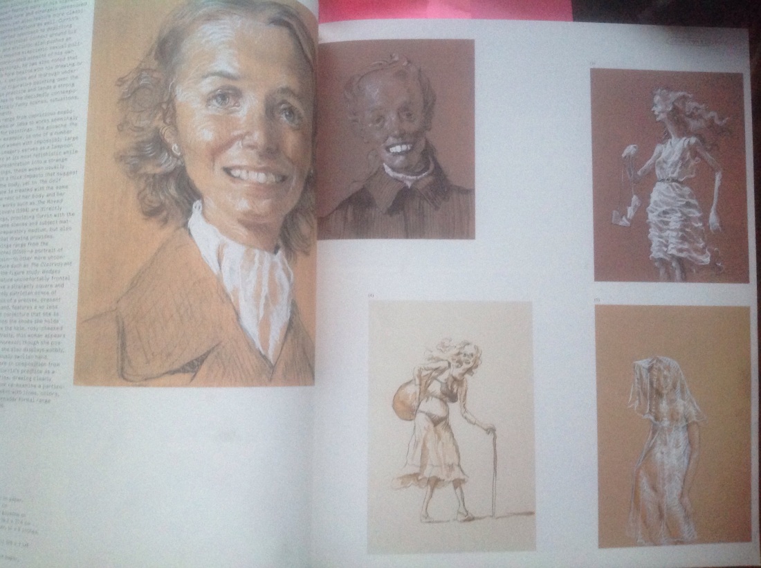
 

Virtual Study event @ The Hepworth Gallery, Lee Millar and the surrealists and contemporary work by V. Sasses. 13/10/18 facilitator Helen Warburton

I was excited to access this event as I find it difficult to guarantee that I will be able to travel on a set day to conventional group visits due to Mental Health issues. The day did not disappoint!  My aim was to learn both about the topic-‘ Discovering new artists and new ways of looking at and thinking about art’ and to benefit from the comments made by the tutor and more experienced students. As the groups was open there were participants from photography and fine art there was a cross- section of opinions. Even better students from different countries added their unique personal and Gallery experience to the mix.

The tutor began with an open discussion on the similarities and differences between the two exhibitions in terms of the artists themselves and the way that the exhibitions were presented. I came away from this with an appetite to dig further into the background of both artists stimulated by comments and questions raised in the group and for the first time I consciously spent time thinking about how the differing presentation affected my overal impressions. Am I being unconsciously biased by the curator ‘s choice or message or by environmental factors in room? Will my impression of the artist be fair and balanced?

The pack was amazing and as several students commented. It would be possible to become completely absorbed following the many links provided. The reflection questions from the pack were extremely appropriate and formed part of the overal discussion without the need to work through them which I find refreshing.

Overal the session had a really relaxed and unpressured feel which was key for me and I was surprised how natural the discussion across subjects and student levels was. I have gained confidence listening to fellow students reflection skills and feel more inspired to know what au want to look for during gallery visits and personal artist research. Perhaps the best proof of this is that I have since managed to make a personal visit to the Ashmolian Gallery. I was able to pre-research And plan my trip to suit the needs of my current course module. Happily I came away feeling more confident in my analysis and with photographs, styalistic ideas and opinions that I have been able to use in my figurative coursework eg. Francis Bacon’s intuitive and textured nude showing movement, mark making and tone that would not have been obvious from photographs alone.

Facial techniques:Elizabeth Payton /Graham Little

Elizabeth Peynton

http://channel.louisiana.dk/video/elizabeth-peyton-faces-contain-their-time

I love listening to interviews with artists as I feel it reveals so much more about their mechanisms and thought in a way that was not possible 15+ years  ago when the only source was letters and diaries which are often only available to the public during  an exhibition.

Peyton is very open about her style. She likes to paint people she admires because they ” radiate something special “. She explains that several people can have similar facial shapes and features but it is the way they use their muscles ( to smile , frown, think etc) that builds up the characteristics of their face. E.g. She cites a painting of a young Napolian “becoming who he was”. What a wonderful observation- our features mature as we develop facial habits- smile lines or looking through a fringe etc. This is really interesting to me as I have begun to realise that it is the difference in people that I like to record.

Peyton’s style varies: sometimes it is thick and angular flowing work and tonal with little fine line detail and sometimes it is traditional fine artwork with balanced line and tone in finely worked entail. Other works are almost white with few skin tones to represent the way she sees the subject e.g. prince Harry with light radiating out. Oddly paintings of the royal family are not particularly true to reality. I hoped that I would love her flowing tonal work for its freedom but something is lost in what she leaves out of yhe work. I prefer her more balanced accurate work e.g. David Bowey. His  beautifully painted eyes say so much more than the thick tonal sketch of  him which feels generic and anonymous.

Graham Little appears to styalize many of his paintings- especially earlier works. They are almost impressionistic in that they are grainy mixes of dotted colour but they form a beautiful photo-real work. His drawings are beautiful but as he says he is trying to show a stereotype of a period in time and this too becomes anonymous . Payton manages to pick out her “special features “ that make up each human being and it is this that truley makes work outstanding.


Why be discreet when showing off is so much fun? (2000). The intrigue was not a sexual one for Little, and his most recent series of drawings, shown earlier
— Read on www.flashartonline.com/article/graham-little/

Review of figurative style – Wyndham LewisArt UK | Discover Artworks

Discover artworks, explore venues and meet artists. Art UK is the online home for every public collection in the UK. Featuring over 200,000 oil paintings by some 38,000 artists.
— Read on artuk.org/discover/artworks/search/actor:lewis-wyndham-18821957-66776/page/

Lewis 1920s work is angular and abstract e.g. Tyro and seated figure where tone and a thin black outline is his main device. As time goes on his style develops. It perhaps becomes more conventional as portrait work but the shapes within the tone of sitter’s hair and faces ( e.g. La Suerte ) and the layers of tone become much more sophisticated. In addition line is used beautifully in the shape of eye brows and folded fabric.

I find this development interesting as it illustrates what my tutor explained to me in my last assessment.

David Hockney documentary review

imagine…, 2018: Hockney, the Queen and the Royal Peculiar: http://www.bbc.co.uk/iplayer/episode/b0bng10n via @bbciplayer

It is interesting to watch David Yentil in his amazing way prise out several artistic gems of quotes from Hockney who must by now be weary of giving his views.  I have previously looked at paper reviews of his Yorkshire landscape series and been caught up by the chopped down tree issue and how he continued to paint it in even after it had gone. But, this is only  catchy mefia dtory anc detracts from Hockey’s message:

1. Hockney with all his years of experience was of course considering a much bigger issue: capturing the spectacular landscape in a changing way and improving as an artist. He talked of how his depiction of Hawthorn trees altered dramatically from depiction in 2008 to that in 2009and explained that even he was still continually searching and learning how to paint.

2. The maker of his 2018 stained-glass Yorkshire Hawthorne winfow for Westminster Abbey remarked that yellow was rarely used in glass and tgat light was usually shown as almost clear whites. Hockney chose to use yellow and said ” Yellow is sometimes even brighter that white! ” wow that is a consideration to bear in mind.

3. Finally the reason for including this review here was his thoughts on perspective when drawing figures. He says in his eighths he is still learning about distance and foreshortening. He observes that most artists do not show the change in depth when drawing one leg in front of another. I was very struck by this and have been trying to keep aware of it in my city sketches today. Even a short distance in depth should matter to get better results!


The moving figure

http://www.davidhaines.org/work04.html

David Haines is one of the  suggested artists to review re treatment of movement. He is able to use tone and line to reproduce photoreal pictures. In fact the reality is disturbing in some ways because the subject matter appears almost violently disengaged from society. The  ‘protagonists’ appear anonymised by their scarf clad faces and tracksuit, Burberry and hoodie uniform of the time. Although the artist may be trying to suggest brand stereotyping through his titles I feel that trainer brands and KFC are superficial and have little to do with the message as I am so affected by the sinister undertones. We are all influenced by experiences so maybe my reaction is a reflection of mine? I am haunted by the percing stares and the movement frozen in time? How does he do this with soft  pencil strokes usually indicative of sweet scenes? He uses soft tones paridoxically but very effectively to suggest the hard reality and bitter message of deserted and abandoned landscapes.

Perhaps it is the frozen poses? Just as Walkowitz drew Isadora Duncan dancing over 1000 times. By doing this so often Walkowitz said he could predict her next move and was able to capture a fleeting gesture or stance static in time- like looking at individual frames in a film strip. This perhaps is the gift given by patient and persistent practice?Haynes has obviously employed it to his subjects in order to show them poised on the brink of action. Little appears on the internet about his interpritation of this period in his drawing which leaves an emptyness for me. I know it must suggest his upbringing in Nottingham and that he challenges some tough ideas around sexuality (his veiled drawings depicting male auicide and 2013 video work two mirrors which is a study around viewers of pornography and how work appears to them as a ‘watcher’. I can’t  see anything else personal in this part of his work and gor ne this detracts ftom it. But it leads me to wonder should artists have to reveal themselves in thier work? Am I being voaristic? Am I overthinking the experience or not putting my personsl experience into the work?Perhaps not but I think I connect better to those who do make themseves more vulnerable- a human bond forms between artists and viewer and I believe that the viewer feels safe to imerse themselves in the piece.

Richard  Hambleton is the other artist mentioned in this discussion of movement http://www.artnet.com/artists/richard-hambleton/

It interests me that I feel much more comfortable with Hambleton’s work such as Untitled standing. Is it because it is close to ‘my emerging style’? By this I mean that I get where he is coming from: how he produced his work; the frenetic energy used to make it and the identification with his symbolism. I like the annonimity and the hectic energy. I can sense the tension in his drawing hand and the whirr of ideas from his head. Oddly I don’t have this connection with Haines. His characters are still annonymous behind their makeshift masks , they say much less to me. They are ‘good art’ but I need to connect emotionally with art to love it! Hambleton might appear less technically acomplished but the mental challenge thrown down to ‘ fill in the blanks’ suggested by his work means much more to me.

Further reflections after thinking about these two styles for a few days:

As always there is a fusion between ideas that an artists sees in another’s work. Yesterday I was in London and felt a new level of awareness for my arguments. For me I think I like parts of Richard Hambleton’s style to emphasise speed and bizz. It is perhaps good to capture in an initial study for a work and to show something personal about one person – as Hambleton himself did in his single shadow silhouette work where there is no tone value to give a message about the depicted person.

However I think my view towards David Haines’ work was initially impaired by the shock value of his subjects. I imagine this is the intention and is certainly a good way to put across a message about bullying ,cruelty and sex. Underneath though Haines uses a very sensitive detailed process to achieve movements frozen in time. I like this idea. It struck. me as useful for city life depictions. For example, people are all in a hurry and don’t stand still for an artist to draw them but they all have a story and a purpose in what they are doing. People opposite you on an underground carriage- all engaged in different activities but all present at one moment. Freeze time and they are able to show a bit of their story. In my drawing one man is laughing at a funny clip on his phone while the two women nearby gossip. I can’t show this in Hambleton style but I can in Haines’ way. So , room for both techniques!